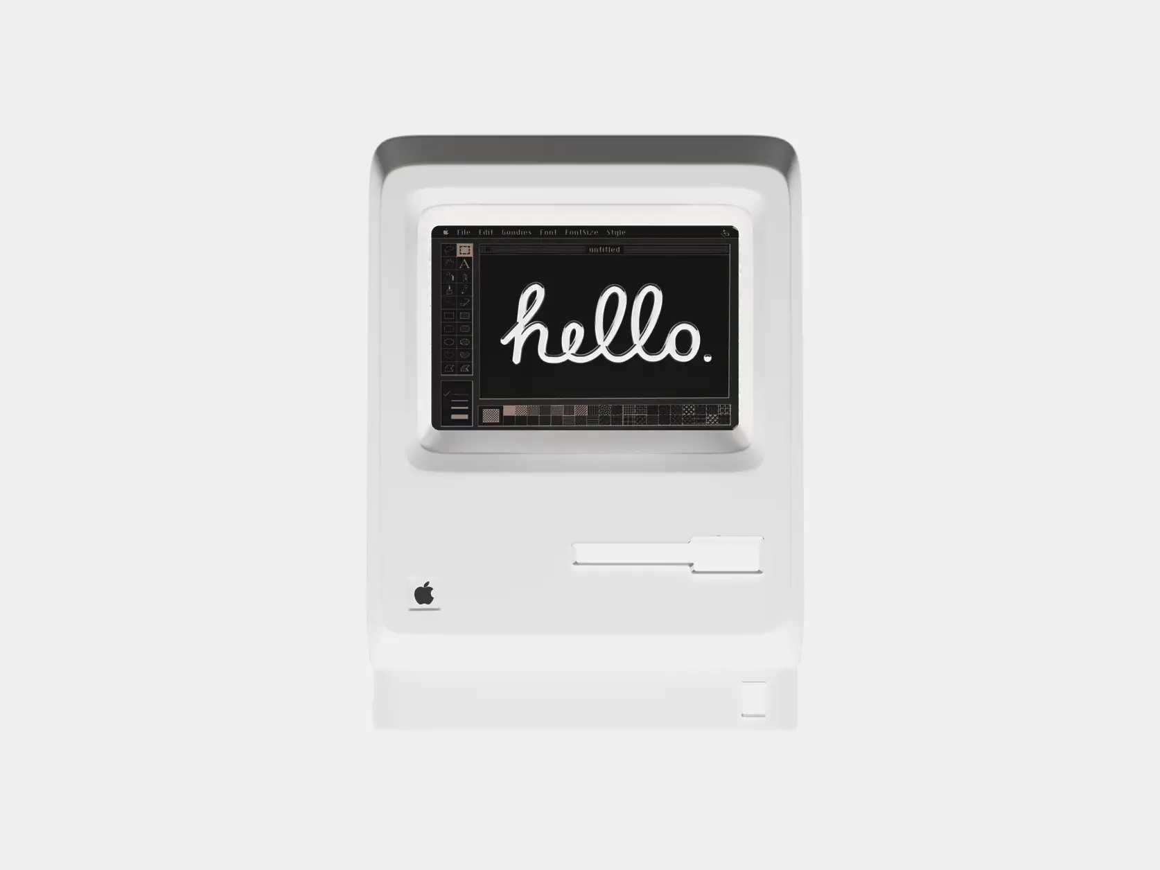
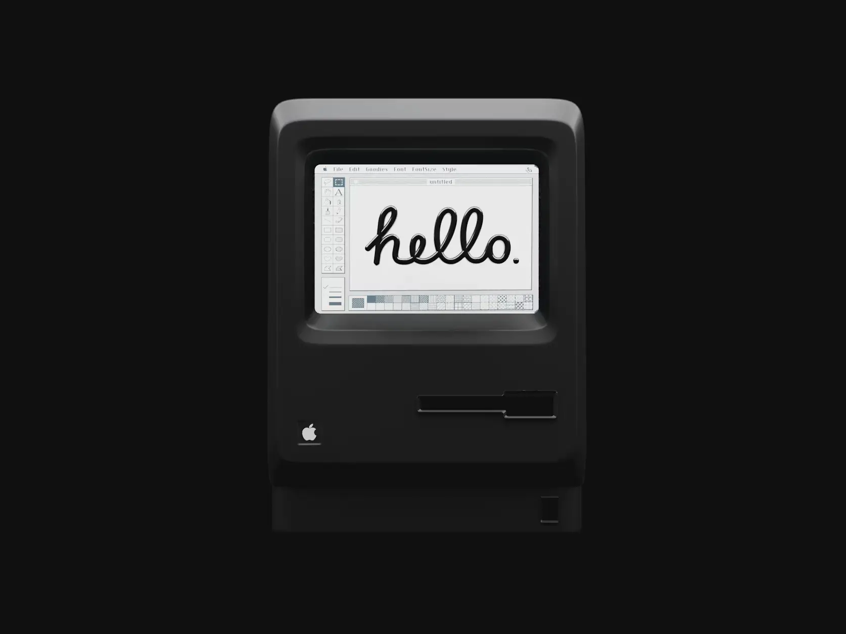
Comparison Slider
Before/after image comparison with draggable or hover controls
comparison-slider-tw
Customize
50
3
36
Props
| Name | Type | Default | Description |
|---|---|---|---|
| beforeImage | string | "" | URL for the before image (left/top layer) |
| afterImage | string | "" | URL for the after image (right/bottom layer) |
| beforeAlt | string | "Before" | Alt text for the before image |
| afterAlt | string | "After" | Alt text for the after image |
| initialPosition | number | 50 | Initial position of the slider (0-100) |
| orientation | "horizontal" | "vertical" | "horizontal" | Orientation of the slider |
| enableInertia | boolean | true | Enable inertia/momentum on drag release |
| dragOnHover | boolean | false | Enable drag on hover without clicking |
| autoAnimate | boolean | false | Auto-animate slider with smooth random movement |
| dividerWidth | number | 3 | Width of the divider line in pixels |
| showHandle | boolean | true | Show the draggable handle with icon |
| handleSize | number | 48 | Size of the handle in pixels |
| handleIcon | React.ReactNode | undefined | Custom icon component for the handle |
| dividerColor | string | "white" | Color of the divider line |
| handleColor | string | "white" | Color of the handle background |
| onPositionChange | (position: number) => void | undefined | Callback when slider position changes |
| className | string | "" | Additional CSS classes for the container |
| imageClassName | string | "" | Additional CSS classes for both images |
| showLabels | boolean | false | Show before/after labels on images |
| labelText | { before: string; after: string } | { before: "Before", after: "After" } | Custom text for labels |
| labelPosition | "top-left" | "top-right" | "bottom-left" | "bottom-right" | "top-left" | Position of the labels |
| labelClassName | string | "" | Additional CSS classes for both labels |
| beforeLabelClassName | string | "" | Additional CSS classes for before label |
| afterLabelClassName | string | "" | Additional CSS classes for after label |
| showPercentage | boolean | false | Show percentage indicator |
| percentagePosition | "top" | "bottom" | "top" | Position of percentage indicator |
| onDragStart | () => void | undefined | Callback when drag starts |
| onDragEnd | () => void | undefined | Callback when drag ends |
| ariaLabel | string | "Image comparison slider" | Custom ARIA label for accessibility |
| reducedMotion | boolean | false | Respect prefers-reduced-motion setting |
Demo images by Alexander Shatov @ unsplash.com, not part of the React Bits Pro offer.